
Color is often an overlooked aspect of web accessibility, especially for brands and particularly governments, that have designed style guides and color palettes prior to accessibility becoming a priority.
To understand how color and accessibility intersect, it’s first important to distinguish between “color dependence” and “contrast.” As 18F states in it’s accessibility guide:
Color contrast is the ratio of the foreground color(text) and the background color. … Color dependence is the need to see color to understand the information. An example of this would be The required fields are red. Some users may not be able to distinguish red from other colors and would lack information to fill out this form.
WebAIM notes that the term “color contrast” is never used in the Web Content Accessibility Guidelines 2.0.
Color
The WCAG “Use of Color” success criterion states that color should not be used as the “only visual means of conveying information, indicating an action, prompting a response, or distinguishing a visual element.”
This criterion falls under a Level A requirement and is an important issue governments must consider when implementing digital services. Even the U.S. federal government has incorporated an accessible color palette into its web design system.
Contrast
According to WebAIM contrast is “a measure of the difference in perceived ‘luminance’ or brightness between two colors … This brightness difference is expressed as a ratio ranging from 1:1 (e.g., white text on a white background) to 21:1 (e.g., black text on a white background).”
WCAG 2.0 designates 4.5:1 as the minimum contrast ratio requirements for Level AA conformance.
The contrast requirement between the body text and link text is 3:1. However, this doesn’t apply to styled links, such as those in a page header, navigation and other areas where there are clear visual cues (buttons, menus) that aid the user in identifying element as links.
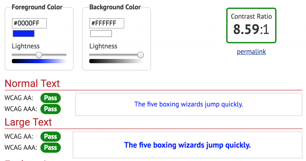
Example contrast ratio pass:
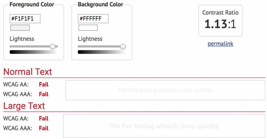
Example contrast ratio fail:
Exceptions
According to W3C, exceptions to this requirement include:
- Large Text: Large-scale text and images of large-scale text have a contrast ratio of at least 3:1;
- Incidental: Text or images of text that are part of an inactive user interface component, that are pure decoration, that are not visible to anyone, or that are part of a picture that contains significant other visual content, have no contrast requirement.
- Logotypes: Text that is part of a logo or brand name has no minimum contrast requirement.
Benefits
According to the W3C these user types benefit from accessible color consideration:
- Users with partial sight often experience limited color vision.
- Some older users may not be able to see color well.
- Users who have color-blindness benefit when information conveyed by color is available in other visual ways.
- People using text-only, limited color, or monochrome displays may be unable to access color-dependent information.
- Users who have problems distinguishing between colors can look or listen for text cues.
- People using Braille displays or other tactile interfaces can detect text cues by touch.
ProudCity and colors
Governments using the ProudCity Platform are able to customize certain elements of the theme (i.e. link colors, navigation bar and footer backgrounds) with their respective brand colors. Non-brand elements (i.e. body and header text, horizontal rules) are, where necessary, standardized and designed to meet WCAG color and contrast requirements.
Testing
Tools for testing web color and contrast:
- Color Contrast Checker (WebAIM)
- Web Accessibility Evaluation Tool (WebAIM)
- ProudCity Accessibility Checker (PAC)
Resources
- Understanding Success Criterion 1.4.1: Use of Color (W3C)
- Understanding Success Criterion 1.4.3: Contrast (Minimum) (W3C)
- Colors with Good Contrast (W3C)
- Color and contrast (18F)
- Government web accessibility
- ProudCity Accessibility Checker
ProudCity is a digital government platform that makes it easy and cost-effective to launch and manage all aspects of digital government services, including websites, meetings, online forms and payments.
Subscribe to our newsletter or connect with us on Twitter, LinkedIn and elsewhere.